MetaLearn
Learn smarter not harder

Overview
Meta is an edutech SaaS that assists learners to be more effective when studying and learning. Many students use study techniques that are ineffective or give the illusion of learning, but in fact are just engaging in “busy work”. MetaLearn aims to assist learners in two ways: encourage more frequent studying through building strong study habits, and making study more effective.
This project was one of my client projects as part of the Academy Xi UX/UI Transform course.
Role
UX/UI Designer
User Research, User Interview, Rapid Prototyping, Wireframing, Usability Testing
Background
Meta is an edutech SaaS that assists learners to be more effective when studying and learning. Many students use study techniques that are ineffective or give the illusion of learning, but in fact are just engaging in “busy work”. MetaLearn aims to assist learners in two ways: encourage more frequent studying through building strong study habits, and making study more effective.
Project Objectives
To test the following hypothesis associated with the MVP features:
Existing problem statement: Learning is hard for many people because they do not use effective techniques when they learn, they find it difficult to focus and structure their study tasks and time, and learning science is not properly applied during the learning process
Current hypothesis: If we make it easy for learners to manage their study goals and activities, and give them access to effective study techniques for their learning practice, we can help them save time and improve their learning results
Existing solution: A set of web and mobile apps that enable users to organise, track and monitor their learning activities and goals, and easily learn about evidence-based learning techniques
Discover

Research
Working collaboratively, our research consisted of:
Competitor analysis: Showed that many learning management apps do not help students to learn effectively. These include project management tools (e.g. Trello, Notion), tracking apps (e.g. Habitica) and motivational app (e.g. Fabulous)
Online surveys: Showed that the 2 main challenges of learners were time management and distractions (e.g. phones, social media, web surfing)
1-on-1 interviews: Showed that while learners typically feel excited when learning something new or commencing a learning session, this initial enthusiasm later develops into a “downhill spiral” of overwhelming feelings of stress and apathy
MVP (current) usability testing: Showed the feedback concerning the MVP varied. Learners found the MVP did not assist them to learn more effectively, they were confused with the timer function in the MVP, and they were unclear if the MVP solely comprised of just a scheduler
These research findings can be seen below.


Define

Persona & Customer Journey Map
From the data and feedback we received as part of the research process we were able to create our persona and customer journey map.
Meet Ben, 28 years-old, young and ambitious. He is a full-time consultant at one of the Big 4 accounting firms, and also studying a part-time Masters at UNSW. He likes to improve his guitar skills during the week. His week is busy balancing, work, hobbies and study. He spends his Friday nights with his colleagues, and his weekends with his girlfriend and soccer team. Ben finds it hard to juggle his many commitments while keeping on top of his studies.
From Ben and his customer journey map (particularly the pain points we discovered) we were able to develop our How Might We. This can all be found below.


How might we encourage better study habits amongst students and increase their efficiencies while learning?
Develop

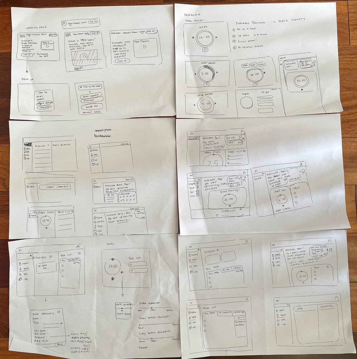
Ideation Workshop
Integration of MetaLearn calendar with a user’s existing planner (e.g. Google Calendar, Outlook Calendar)
Quiz during user onboarding process to better understand a user’s learning technique and learning behaviour
Short video explaining the fundamentals of building learning habits (although this MVP was not implemented during the Academy Xi Sprint, it was explored further in my Solo Sprint later below)
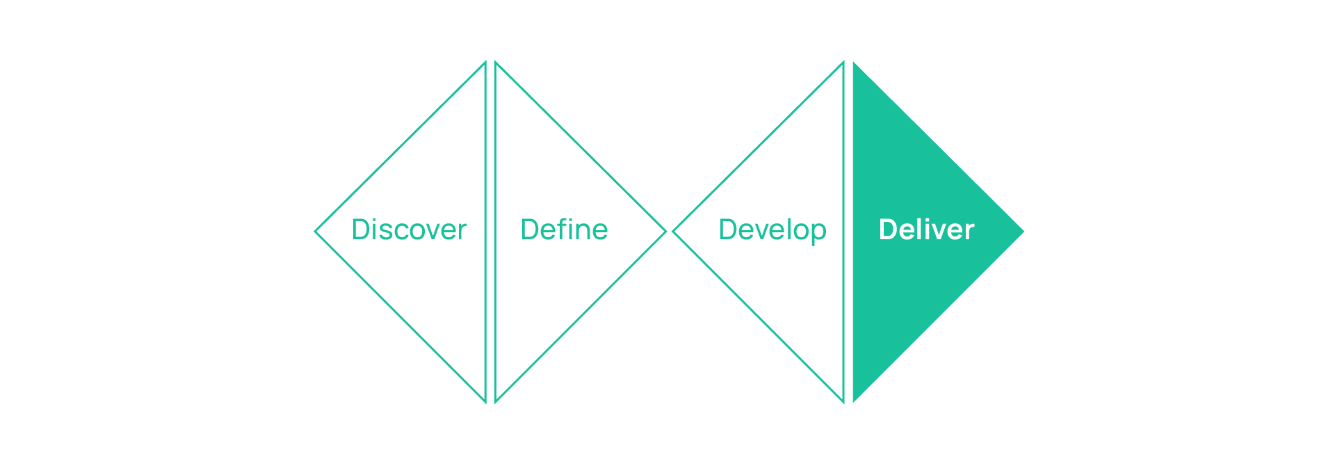
Deliver
Usability Testing
We conducted another round of usability testing to test if the first iteration of MVPs (MVP Version 1) answered the How Might We statement. We then conducted a second iteration (MVP Version 2) based on the usability testing feedback of MVP Version 1. Below is the key feedback and results of the usability testing conducted on MVP Version 2:
The Landing page is one of the most crucial parts of the app. The page needs to sell MetaLearn and strongly encourage learners like Ben to sign up. Some of the feedback included 65% of users wanting more call to actions and 95% of users wanting snapshots of the modules for enhanced familiarity
Onboarding quiz and the reason why it had to be completed was unclear. It was also unclear how the onboarding quiz personalised a user’s dashboard (“I didn’t understand why I had to take it” and “It seems easier to skip than go next.”)
The top navigation bar was originally used to provide a “quote of the day”. However, users have suggested that the top navigation bar should instead be used to provide study technique tips and hints
The to-do list was unintuitive (“The to-do list looks really busy and overwhelming”)
Meta Library received the most positive feedback with users finding this feature to be insightful and helpful (“This is the best part of the website” and “This is probably the most useful. Learning tips are very valuable”)
The dashboard was a portal that was created and personalised based on a learner’s responses to the onboarding quiz. However, users were confused on how the quiz personalised the dashboard. Many users also found the dashboard unintuitive and overwhelming (“Scaling seems a bit off” and “Am I starting a new session or an existing one?”)
Question mark icon located in the top navigation bar that provides users information about how to use the features on the dashboard was added after receiving the above feedback regarding the dashboard
The below video shows the MVP Version 2 made with the Academy Xi Group. The overall feedback from users concerning MVP Version 2 was varied. Users said MVP Version 2 was an improvement from the original MVP but many users were still unclear how Metalearn increases their efficiency while learning.
Due to time constraints, however, we were not provided an opportunity to further iterate the MVPs.
I decided to undertake a Solo Sprint in order to conduct another round of iterations.
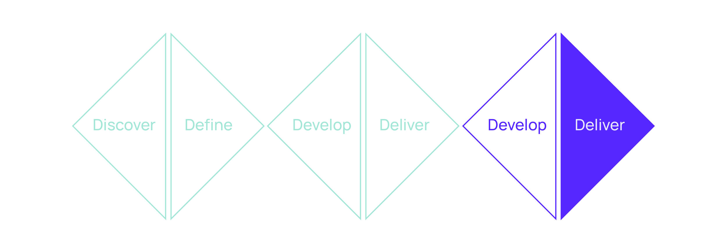
Develop (Solo Sprint)

Synthesising MVP Version 2 Usability Testing Feedback
I decided to undertake a Solo Sprint in order to conduct another round of iterations. I started this by first synthesising the usability testing feedback for MVP Version 2:
Landing page did not sell MetaLearn. People still think it’s a productivity tool rather than a learning app. (“How do these modules help me study?”). Solution: 8/15 users suggested a video explaining the app would help them in better understanding MetaLearn
Onboarding quiz was still unclear how it is beneficial to the user and personalised their dashboards (“I wonder how much this can personalise for me.”). Solution: Eliminate the quiz for now until further research and investigation about the questions asked and how the quiz can create a personalised the dashboard for the users
Onboarding quiz, how it is beneficial to the user and how it personalises the user’s dashboard was still unclear (“I wonder how much this can personalise for me”). Solution: Eliminate the quiz for now until further research is conducted and investigate how the quiz could create a more personalised dashboard for the users
Calendar competes with a user’s existing calendars, such as Google Calendar and Outlook Calendar, and users do not find it solves their pain points. That being said, the create a task list feature was found to be useful (“Create task is easy to understand”). It was further found that 33% of users would not use the calendar and 45% of users still had further queries regarding the calendar Solution: Keep the calendar minimal and emphasized on the task list
Dashboard received many complaints about the look and feel, and being unintuitive, e.g. writings not aligned, side bar could be bigger, inconsistent shadows (“I don’t know where to start. I don’t know what to do.” and “I think it’s quite overwhelming.”). Solution: Simplify the dashboard, emphasize on what can help the users to learn more efficiently.
Study session timer users don’t know why they need it (“Wouldn’t really use a timer for a study session, as I become too focused and don’t want to be told to stop.”). Solution: needs an explanation about what it is (Podomoro technique) and how Podomoro technique can help users to study more efficiently.
Study session pop-up users do not find it useful to learn effectively and feel it creates more work for them (“How does this help me?”). Solution: research more on how this feature can intuitively and effectively help users reflect and be able to study more effectively from reflecting.
Meta Library users find this section to be most helpful and able to help them to learn effectively by understanding and having knowledge of study technique. (This is probably the most useful, if there are a lot of contents.” and “This is the best part of the website.”). Solution: keep and expand the Meta Library.
Rebranding colours
Usability testing feedback said the look and feel of the current MetaLearn looks unfinished, too cartoony and reminded them of a medical look. Therefore, utilising my skills and experience in graphic design, I redesigned the branding colours which Founders had mentioned on our initial briefing that they are open for us to do so, especially to stand out from competitors (metalearn.com).

Lo-fi usability testing
I started building the MVP Version 3 in the lo-fi and tested it with 4 users.
The feedback from MVP Version 3 were:
Dashboard looks odd, users feel unfamiliar with the look and feel
Podomoro timer is clearer and more understandable on how it can benefit them
More intuitive and efficient to start learning

Mid to hi-fi usability testing
The feedback from from this usability testing were":
Save Task: users find this more useful than MVP Version 2 where they can create tasks before they start studying, now they can start studying and save tasks later (“This is good to give an option if I want to save or not.”).
Meta Library: changing wording “Search study technique” to “Search”, eliminates shadow on each article, the shadow gives a button effect look.
Dashboard: Learning tips and tricks need to stand out. The timer needs to be explained that it is the Podomoro technique.
Podomoro timer: Change the settings icon bigger.

Deliver
I was fortunate to be able to present the latest MVP under my Solo Sprint to the Founders of the MetaLearn team. This was an amazing experience receiving valuable feedback personally from the Team which will help me grow in becoming a better designer.

Future Customer Journey
As Ben logs into MetaLearn he can immediately start learning using the “Podomoro Timer, which helps him to learn effectively (focus and avoid burnout). If Ben prefers, he can schedule his learning session on the “Calendar” feature on MetaLearn which syncs to his existing Google Calendar. Additionally, Ben is now able to access more learning techniques in the Meta Library.
Next Steps
The next steps we would need to undertake before finalising the MVP are:
Conduct usability testing with more Bens to test MVP Version 4
More research of quiz’ queries to be asked and how it can personalised a user’s dashboard
Iterate and conduct usability testing for further improvement of the ‘calendar’ and ‘task list’
Results
4/4 said they want to sign up with MetaLearn, the ‘video’ would encourage them to explain what MetaLearn is. Furthermore, the new branding and visuals attract them to find out more. (“‘Your learning buddy helps you learn better and more effectively’ makes it clear and selling.”)
3/4 said the reason why they would sign up is because of the Podomoro Timer and Meta Library. (“Meta Library would help me a lot. No one taught me how to learn effectively.”)
4/4 said this is better to navigate and understand than the previous MVP. “This dashboard, inviting in the sense that it makes me want to use it.”).
4/4 love the colours and visual. “I’d be proud to have on my screen looks nice. It actually makes me feel good. Before this looked a bit childish/too cartoony.”
Why are these features important for the business?
Acquire new customers. As this is a new SaaS product, one of the primary goals was to ‘sell’ the product to new customers. It was important to keep the product clear, simple and engaging in order to encourage new sign ups.
Improve better experience. Customer rate satisfaction increased 50% in comparison to the original MVP. A positive user experience on the platform is vital to retaining our customers.
Customer retention/loyalty. Customer retention is key. One of the features we created to retain users is our ‘Meta Library’. Quality explanations of practical learning techniques are hard to come by but MetaLearn continues to update their Meta Library so as to help users improve their learning and build customer loyalty in the long-run.
Personal Takeaways
Don’t be afraid to fail. Initially I was afraid to change the branding, even though Founders are open with it but turns out it leads to higher sign up rates!
Importance in being persistent. During my Solo Sprint I was unsure if I could improve the MVP but with hard work, numerous sketches and iterations. I successfully improved the MVP to be more intuitive. (“This dashboard is much better in this version than the previous one. Previous one had so much going on.”)
Presenting with confidence. My opportunity to present back to the Founders was important, especially when I delivered the final product and what I found was most important was validating the product with data, in this case user feedback.