Field Toolkit
Empowering field technicians through technology

Client
A state-owned enterprise that manages the construction and operation of the country’s national broadband network. The client utilises various telecommunication technologies including fibre-optic, fixed wireless, and satellite technologies to operate its network.
Stakeholders
Product Owners, Business Solution Manager, Field Engineers and Technicians,, Software Engineers, Solution Architect
My Role
My role as a UX Designer involved conducting user interviews, mapping user journeys, designing wireframes and prototypes, running usability tests, and collaborating closely with various stakeholders.
Background
The engagement focused on enhancing the “Field Toolkit” app, the main tool used by the client’s field technicians. The goal was to improve its usability and efficiency while maintaining a consistent brand experience. These improvements aimed to increase technician productivity, satisfaction, and retention, acknowledging their crucial role in successful telecom installations and the client’s overall business performance.
Discover
Challenges
User Feedback
“Why not build one app for it all? We don’t care if the background is pale or sky blue. We just need to access and upload information quickly!”
Key Challenges
Low retention among field technicians: The cumbersome UX led to low adoption and retention of the Field Toolkit app.
Ineffective design approach: The previous UX design process failed to address the real pain points faced by field technicians.


Define
Problem Statement
How might we enhance the user-friendliness, task management efficiency, and brand alignment of the "Field Toolkit" app used by field technicians in order to improve their operational effectiveness?
Process
Understanding the Current App Build
We conducted guerrilla testing and synthesised feedback received from distributed feedback forms to understand the then current app build.
Commencing the Redesign Phase
The redesign phase began after synthesising of the feedback received was completed, which formed the basis of the redesign process.
Adding Features Suggested by Product Owner via JIRA Tickets
New features were added to the Field Toolkit app based on JIRA tickets, which includes the acceptance criteria, created by a product owner
Concept Ideation to Final Design
I created wireframes to illustrate my ideas based on the acceptance criteria. I then showcased my designs to my stakeholders, I gathered feedback from these stakeholders, and then iterated my design based on this feedback
Collaborating with Developers and Addressing Technical Challenges
After the design is finalised, I then worked together with our software development team to build the new features and ensure a smooth development process. This collaboration was also important in the resolving of any technical issues and making adjustments to the design
Insights and Persona Needs
Users were overwhelmed by the number of apps required to complete a task
The Field Toolkit app lacked a clearly defined user journey, making it challenging for users to intuitively navigate the app
The Field Toolkit app’s delay in incorporating comprehensive information results increased the administrative burden of users
Previous Wireframes
Below are the wireframes I inherited as part of this engagement. Issues with the previous interface of the Field Toolkit app included the following:
Based on the data collected from the distributed feedback forms, most users used their smartphones and tablets to access the Field Toolkit app, ranging from the smaller iPhone SE to the latest iPad. These wireframes illustrated that extensive scrolling was required to navigate the app, making it a cumbersome and inefficient process, particularly on smaller screens
The previous UI possessed a readability issue, as shown in the image below, where the grey text was difficult to read against the bright red background

Develop
Early Flow and Wireframe Sketches

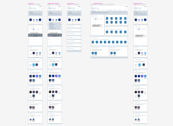
Introducing the New Field Toolkit App (Smart phone)
The new Field Toolkit app for smartphones includes the following features:
Reduced amount of scrolling required in the Field Toolkit app by creating categories for its internal apps
Streamlined the user journey by consolidating the various apps used by field technicians into the Field Toolkit app, reducing the need to switch between multiple apps
Implemented a dark mode for improved usability, especially in well-lit field conditions
Introducing the New Field Toolkit App (Tablet)
The new Field Toolkit app for tablet includes the following features:
Because of the larger screen space on a tablet, users are able to simultaneously view and select between different categories on the left-hand side of the screen while view particular results on the right-hand side of the screen
Overall, a focus was made to enhancing the experience of the Field Toolkit app on its smartphone and tablet versions given 90% of users access the app on these two types of devices
Details About the New Wireframes
In response to user feedback, we redesigned the UI. Users indicated a preference for app grouping or displaying those app most relevant to them, as opposed to an extended scroll function that was adopted in the previous version of the Field Toolkit app
We completed a comprehensive rebranding effort and adopted the client’s design system to ensure uniformity across all the client’s products. This initiative aimed to minimise user confusion, improve navigation, and enhance users’ familiarity with the company’s design system
Recognising that many users operate in well-lit field conditions, we introduced a dark mode feature, which has proved popular among field technicians
We streamlined the user journey by consolidating several apps commonly used by field technicians to complete their tasks. When consolidation was not feasible, we used iframe to mirror some of the apps that were created using Power Apps. This simplified the navigation process for field technicians, eliminating the need to switch between multiple apps
Results
95% of users expressed a preference for the new Field Toolkit app over its previous version
While the new app has proven popular, we later received additional feedback suggesting further enhancements were needed to unlock the full potential of the Field Toolkit app
Given the high level of satisfaction with the new app, the engagement later secured additional funding from the client's capability manager. This was excellent news as it allowed us to continue providing valuable support to the client’s field technicians, and contribute to the overall business success of the client
Personal Takeaways
Some key personal takeaways from the engagement included:
Importance of user-centred design: Gathering data on the prevalent phone and tablet sizes used by our users was particularly important. This insight allowed me to create a user-friendly design that aligned seamlessly with our users’ work preferences
Navigating assumptions for long-lasting success: While challenging assumptions put forward by the product owner can be a delicate exercise, it was a necessary step in ensuring the longevity of the new Field Toolkit app
Importance of collaboration between software developers and the UX designer: Fostering close collaboration with our software development team was key to achieving the engagement’s desired outcomes. Furthermore, striking the right balance between feasibility and UX design importantly ensured that all stakeholders involved in engagement were satisfied with the new Field Toolkit app